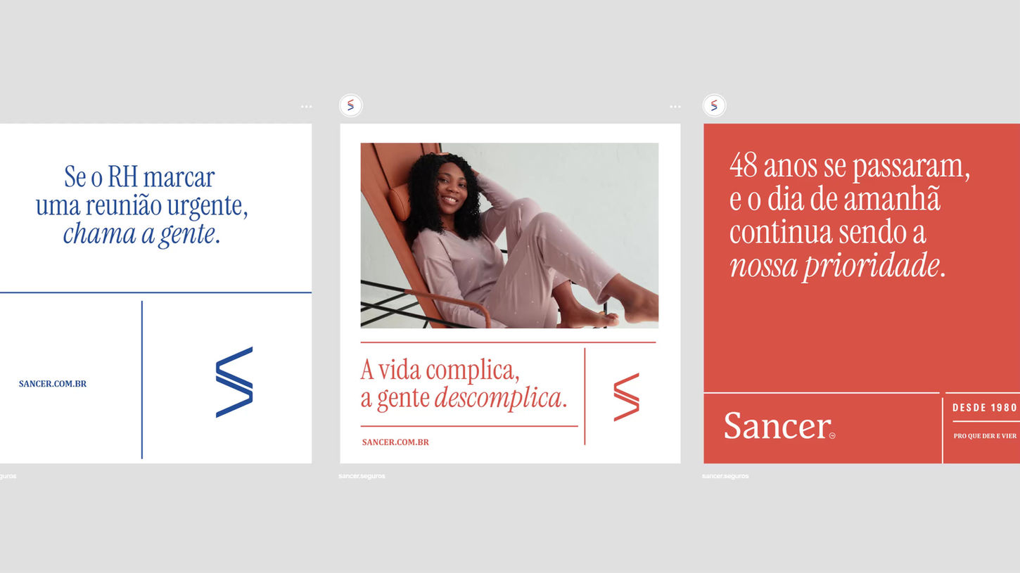
The brand's visual language is clean and follows a simple visual hierarchy. In this case, we focused on addressing a pain point for the audience, who may already be overwhelmed with information and concerns about policies, contracts, and fine print. By the end of the layout, the page or screen should feel light and clear.
Another key feature of this project is the use of color, which plays an important role in building the brand's identity: red is used when Sancer communicates insurance for individuals, and blue is reserved for business-related services.

The brand's verbal language needed to be personal and accessible. The brand can leverage the verbal aspect to break the ice with the reader, using the famous "all-types" advertising style. This doesn’t require much "designer's flair" but it’s a powerful tool. Check out some of the headlines I developed for this project.
At the end of the carousel, you’ll see a campaign idea that tells stories from both the individual’s and the company’s perspective, using colors to promote a big idea (in the style of Serpa) for the brand. For every story, there are two sides. Both are covered by Sancer.
E-mail: martinrocha97@gmail.com
© 2025 by Martin Rocha. Made with Passion™


