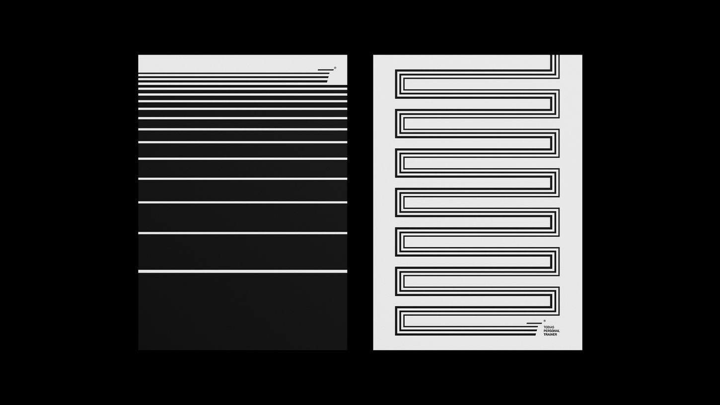
Another key approach to moving away from the idealized body image was placing greater emphasis on text. Targeting an audience seeking a better quality of life through exercise, Tobias immediately offers a sense of relief from the daily grind. He invites people into a conversation — an honest, welcoming one about life — without overwhelming them with technical details of biomechanics, physiology, and all the things only he needs to master.
Set within a visual style reminiscent of the golden age of offline advertising, the messaging connects to the golden days of his audience’s own health — back when body aches weren’t a major concern.

In Tobias’s case, the brand’s purpose is to highlight a benefit that goes deeper than aesthetic results and lasts longer than the seasonal rush to hit the gym before summer: it’s about improving life itself, helping students balance the many demands of their routine with greater ease. Our goal is for his audience to see training as part of their weekly rhythm—not just a fleeting moment in the year. As the brand slogan puts it: “movement for life.”
E-mail: martinrocha97@gmail.com
© 2025 by Martin Rocha. Made with Passion™


